Windows 8.1 Review - Small improvements fix some annoyances
By: Arie Slob
Modern Apps
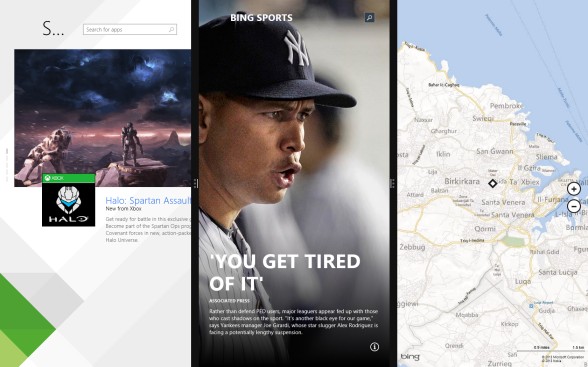
Although it was possible to have two modern apps on screen at once, in the original Windows 8, one app was forced to occupy 320 pixels, while a second app used the remainder of the screen. (Figure) 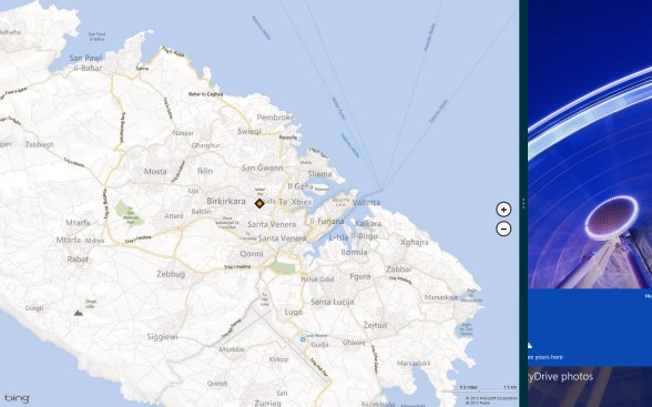
Microsoft has come to their senses and now allows two apps to have half of the screen each, but you can drag the divider line to, say, give one app three quarters of the screen if you prefer.
Depending on the resolution and size of your screen, you might be able to have four modern apps next to each other, but on a tablet such as the Surface Pro, you still are limited to two apps.
On my laptop with 1680x1050 resolution I was able to run three apps simultaneously.
Another welcome change made by Microsoft is for those of us with multiple monitors: apps can now run on secondary monitor(s) too, and use both screens to show different content. For example, an image editing app could have the tools on one screen and the image could occupy the entirety of the other screen.
On my 'classic' 19" dual LCDs I was able to run two apps on each display (Figure) 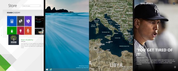 .
.
While these improvements address some of the issues, you are still only able to divide your screen vertically between apps.
Apps can now be better controlled through their own entry in the Settings menu Search & apps (Figure) 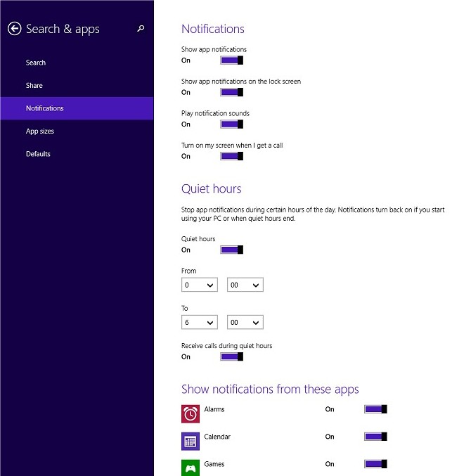 . You can now set "Quiet hours" which disables notifications of apps. There is an option to allow/disallow incoming calls during quiet hours, and another option to have incoming calls switch on the screen, suggesting Microsoft looks to be improving Windows phone capabilities (remember, Microsoft recently purchased Skype).
Another welcome App Setting will be "App sizes", which shows you how much disk space each of your apps is using (Figure) 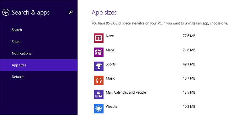 . If you run Windows 8 on a portable device you may have limited disk space available, so you can quickly identify which apps to remove to gain the most space savings.
PC Settings
More settings can now be accessed from the 'Modern UI' PC Settings app (Figure) 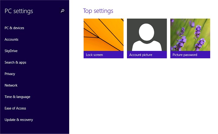 , but for more advanced options you'll still likely to need to access the Control Panel from the desktop.
App Store
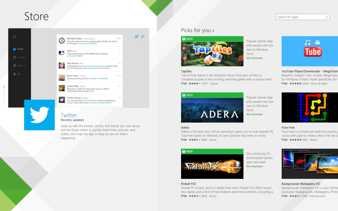
General consensus seems to be that the Windows 8 Store is a dump. You get a few apps listed as "Spotlight", and need endless scrolling to see apps listed by category.
In Windows 8.1 Microsoft offers you personalized recommendations (based on previous apps you installed/purchased) and featured apps. Categories are now hidden in a swipe-down menu (or right-click for us non-touch users), which is an improvement in navigation (Figure)  .
.
Search
In Windows 8.1 Microsoft unifies the search experience. Another improvement that couldn't have come soon enough! Windows 8 original search facility defaulted to searching for Apps (and you had to click on other categories such as Files or Settings if you weren't searching for an app) (Figure)  .
.
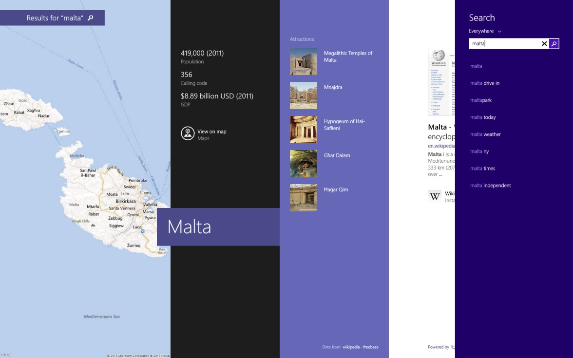
Not only does the updated search now sensibly search everywhere, including the internet, it only uses only a small part of your screen instead of wasting the whole screen as in the original Windows 8 search (Figure) 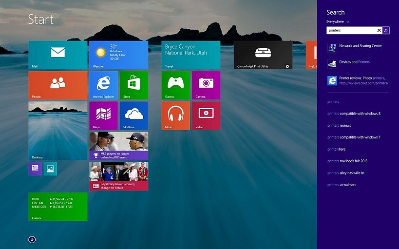 .
.
If you 'execute' a search, Microsoft uses their Bing search engine to display data in a Metro-UI style while using location data (where possible).
For those that prefer to use the desktop only, Windows Search can now be accessed from there too, simply by pressing Winkey + S (Figure) 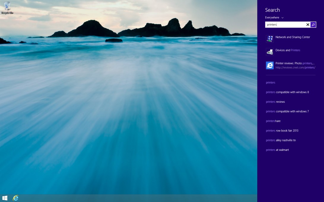 .
.
More Customization
Besides the option to have your desktop background as the background for the Start screen, Windows 8.1 offers more granular hues for you to change the color and background of the Start screen (Figure) 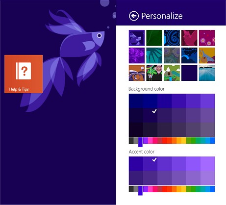 .
.
You can now also choose to play a Slide show on your Lock screen, and select from which folder Windows should display pictures for this slide show (you can select multiple folders).
SkyDrive Integration
 Microsoft has taken its cloud storage offering and tightly integrated it with Windows 8.1. The updated SkyDrive gains more settings to sync, document save integration (save your documents to SkyDrive by default - instead of using your Documents folder) and more syncing options.
You'll first run into the SkyDrive integration as an option during setup where you are offered to turn SkyDrive integration off (Figure) 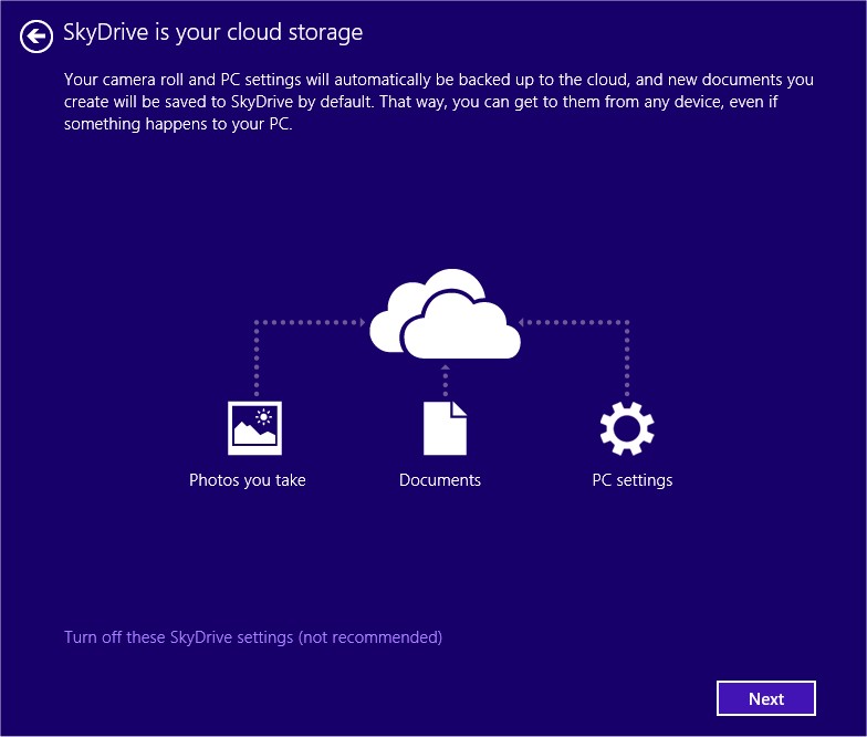 .
.
When you choose to use SkyDrive integration, Windows also creates a SkyDrive folder in your user profile and populates it with shortcuts that duplicate the contents of your cloud-based SkyDrive storage (Figure) 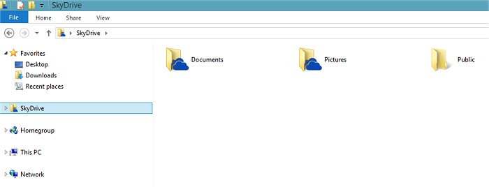 . Windows doesn't sync your SkyDrive cloud content to the local device, but instead using thumbnail's it will just show you which files are available, and when you're online, you can access your files.
If you want to use any of your files offline; just right-click any file or folder and choose Make Available Offline (Figure) 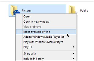 .
.
Windows 8.1's SkyDrive integration still can't beat SkyDrive.com when it comes to functionality (sharing and copying/moving files around), but it is yet another incremental step to improve functionality.
Conclusion
All in all Windows 8.1 is just a refinement of Windows 8, and it still an operating system with split personality; the classic desktop and Modern ('Metro') UI. Until Microsoft swallows its pride and acknowledges that there are a vast number of computer users ('classical' desktop and laptop users) who have no interest in a touch-centric/app centric operating system, Windows 8 will continue to suffer from anemic uptake.

